Beyond Skin Deep: A Case Study in Color, Material & Finish
So, where does the color, material, and finish (CMF) process actually begin? At Play&Co, it’s always considered a design story’s cornerstone from the beginning — and sometimes, it is the story.
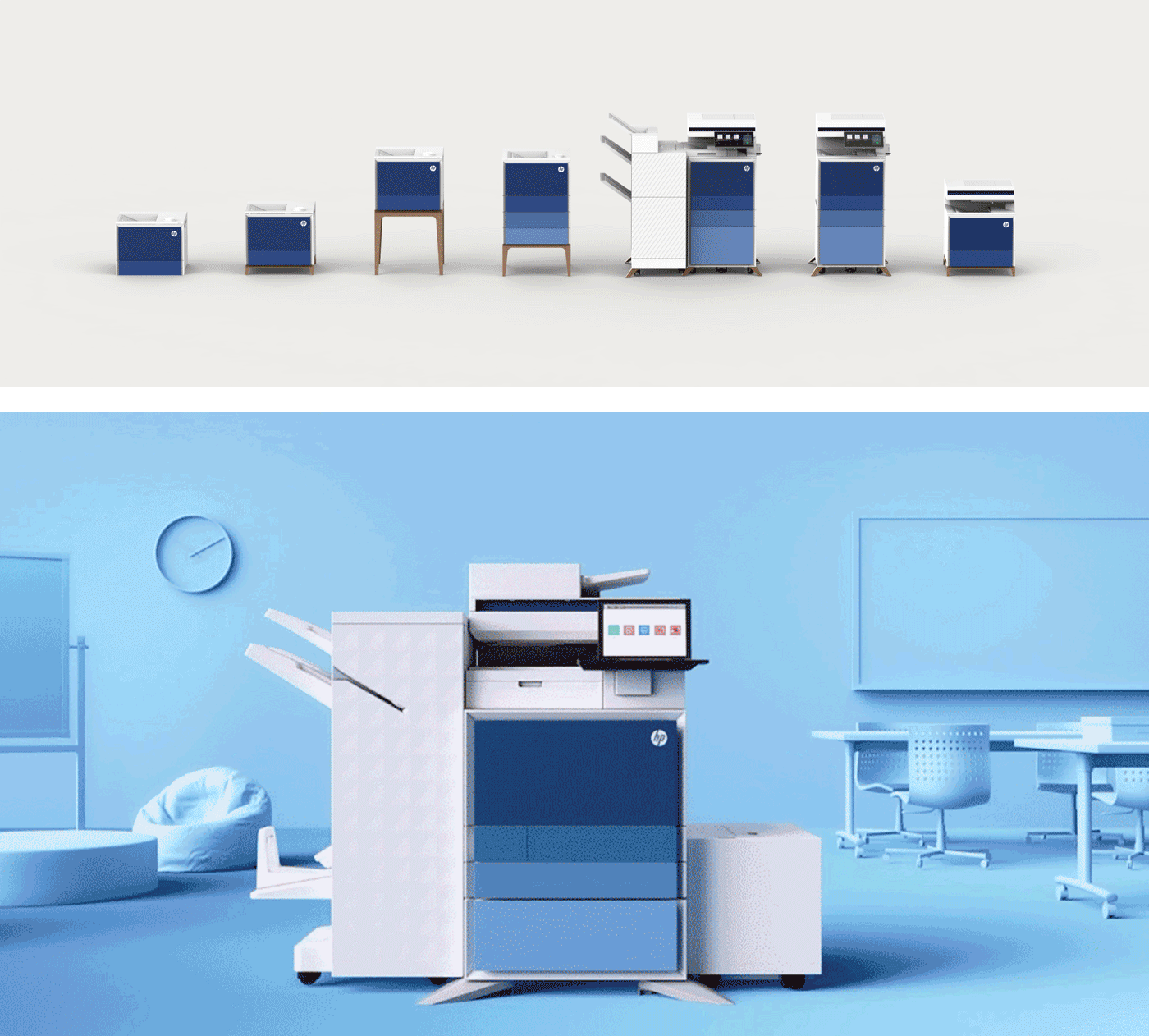
That was the case for our collaboration with HP Enterprise, designing the CMF strategy for their LaserJet Managed Printer range. A project that began, quite simply, with one question: what should the future of workplace technology look and feel like?
Understanding the Context
Before we pick up a color chip or material sample, we seek to understand the landscape. This project was no different. The world was unassumingly pre-COVID — yet shifts in how people worked were already reshaping the contemporary office environment.

Through workplace trend analysis, we identified emerging themes that would influence not just how offices were designed, but how the tools inside them should behave and appear. We identified & explored key driving conditions:
- The rise (and resistance) of the open office.
- The move toward ‘resimercial’ environments — spaces that blend home comfort with workplace functionality.
- The convergence of furniture and technology, where devices no longer hide — they integrate.
- The growing importance of the branded workplace, where environment becomes a living expression of company culture.
- And, of course, the growing movement toward distributed, asynchronous, and hybrid work.
Each of these insights pointed to the same truth: the printer couldn’t just be a grey box in the corner anymore. It needed to fit in — not stand out. To look like it belonged in a contemporary, human-centric environment.
Building the Palette
From there, material research drove the sourcing of hundreds of samples from metals, woods, fabrics, stones, and advanced polymers. We sought materials that balanced sustainability, scalability, and sensibility — low-footprint, recyclable, and available in large quantities without compromising quality or character.
The next phase was exploration and refinement — a sea of renderings, print-outs, and reviews that gradually converged on a cohesive CMF strategy. We mapped every direction against the contextual themes uncovered in our research — the rise of resimercial spaces, the convergence of furniture and technology, and the growing expectation for brands to express their values through environment and product alike. Each concept explored how far we could push hue, vibrance, and tactility without losing HP’s core attributes of precision, reliability, and innovation. It was a constant balancing act — blending the evolving aesthetics of contemporary workspaces with the enduring confidence of HP’s brand personality.

Our focus was to translate that balance into a cohesive CMF system — one adaptable enough to fit diverse environments like healthcare, hospitality, education, office, finance, and industrial spaces, yet still unmistakably HP. The goal was unity without uniformity: a visual language flexible enough to belong anywhere, but distinct enough to always feel like part of the same family.
The Language of Light and Form
The final design introduced a signature ombré gradient across the front panels — a subtle shift in colour that brought life and movement to the form. It wasn’t decorative; it was architectural. The gradient added a quiet dynamism to a large surface, celebrating light and shadow while maintaining a timeless, enduring quality — crucial for a product with a lifespan of up to ten years.
Colour choice was another balancing act. We explored both light and dark base tones — a deceptively simple decision with multi-million-dollar implications. The difference in polymer cost between black and white was substantial. But so were the aesthetic and environmental considerations.
Would a darker product feel more premium and grounded? Would a lighter one integrate more easily into varied office interiors? There was no silver bullet — just a disciplined pursuit of balance.Ultimately, we landed on a scalable system:
- Core range: HP’s signature blue ombré — confident, brand-authentic, and flexible.
- Derivatives: colour variants like coral, green, and yellow to signal different market tiers.
- Premium: explorations into architectural materials that elevated the experience, softened acoustics, and signalled craftsmanship.
It was a bold logistical commitment for HP, but one that became a powerful brand image driver — and it paid off. The range went on to receive multiple international awards, including Red Dot, Good Design, and iF Design Awards in 2023.
Beyond Aesthetics
CMF is often described as the “skin” of a product — but we see it as something deeper. It’s the emotional layer that radiates resonance and beauty, communicates brand identity, signals quality, and reflects values.
Is the product excessive and wasteful? Or simple and balanced? Does it feel transient and disposable? Or honest, timeless, and confident?
Most people can’t articulate why a product feels right — that’s the designer’s job — but they can feel it. And that feeling shapes trust. It’s why Apple can transform a single shade of aluminium into a cultural symbol. It’s why the right material choice can elevate a brand from commodity to icon.
CMF carries real responsibility too. The right finish can extend a product’s life, improve recyclability, and reduce waste. The right palette can outlast fleeting trends. And material honesty — letting a surface look and feel like what it truly is — can quietly build brand equity over decades.
Final Thoughts
At its best, CMF isn’t an afterthought or a finishing touch. It’s a strategic design discipline — the intersection of brand, behaviour, and emotion. It shapes how people relate to products before they even touch them.
Launching a new product or refreshing a range to better reflect your brand’s values? We help shape the connection between how your product looks, feels, and performs. Let’s talk.